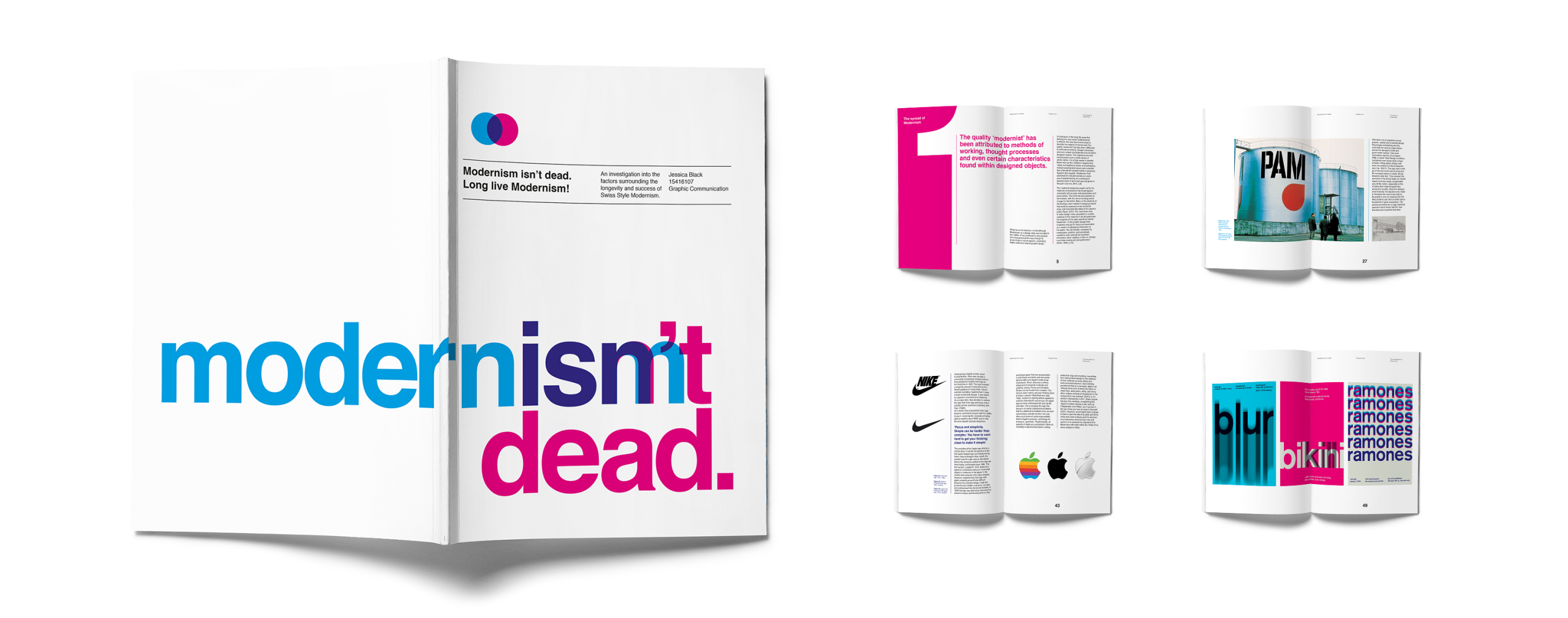
An investigation into the factors surrounding the longevity and success of Swiss Style Modernism.
Introduction
Since its founding in the early 20th Century, Modernism has been the subject of great criticism for its perceived subdued and disconnected approach to design. From the kickback reaction of Post-Modernism in the 1950’s to continuous contention by various design critics and pundits, Modernism has frequently been labelled a design style without substance.
During the era considered the peak of Modernism, critics argued that it was merely the style of corporations, earmarking it as bland and un-relatable. Much of this opinion came from members of the general public who either didn’t understand the philosophies behind the style or already held discontented opinions of the corporations that the modernist designers became involved with. Others saw it as a political agenda masquerading as design because of the utopian values behind the movement and as such it was viewed as untrustworthy. Traditionalists that held in high regard the methods and styles of the past, took great offence to the introduction of a movement that proposed the abandoning of everything they held sacred.
In more recent times, following the launch of the exhibition ‘Modernism – designing a new world’ at the V&A in early, the movement came under fire repeatedly by various critics portraying the style as ‘Frankenstein’s monster rising from the dead’ (Sudjic, 2006). In one such article, Simon Jenkins urged his readers to go and see what he called ‘the most terrifying show I have ever seen’ (Jenkins, 2006). Critics like Jenkins accuse Modernism and the Designers that proclaim its brilliance, of overlooking the hard work and passion invested by so many traditionalist creatives before them. He views the modernist style as lazy and overused; ‘Modernism was never a style. It was a rejection of style, because style required hard work and talent’ (Jenkins, 2006).
It seems so easy to contend the dismissive values of the modernist movement in one breath whilst ignoring the self-committing of the same act in another. Why is it so easy to dismiss the efforts and investments made by the designers of the Modernism movement considering the longevity that the style has managed to maintain? Doesn’t this speak volumes about the very ethos of social responsibility behind the movement and the public’s reaction to it? This study aims to highlight the pivotal points in the development of Modernism and its implementation across the world, demonstrating that it’s values hold as much relevance today as they did when the style was founded. Whilst identifying the key figures of Modernism and their works that made them so, we shall pinpoint the principles behind the movement and identify the ways in which they have been used to enable the production of socially responsible design.
Throughout this study the sub-style of Modernism that we will focus on predominantly is Swiss Style graphic design, due to its more intense approach to style reduction, with the aim of convincing critics of its universal qualities and demonstrating its ‘almost timeless beauty’ (Black and Taylor, 2018).
The spread of Modernism
What we are to discover, is that although Modernism as a design style was founded in the 1920s, it has continued to see success and resurgence all the way through to present day in some aspects, resonating highly within the field of graphic design.
It is because of this long life-span that defining the very notion of Modernism is difficult. Not only has it been used to describe the original art movement, the quality ‘modernist’ has also been attributed to methods of working, thought processes and even certain characteristics found within designed objects. The original movement encompasses such a wide variety of artistic styles, it is simply easier to identify Modernism as the method of abandoning ‘dated and traditional’ styles and techniques, instead adopting techniques and materials that reflected the idealist beliefs in progress, freedom and equality. ‘Modernism that abolished the old and started out anew…was characterised by an undoing and abandonment of what had seemed given in the past’ (Connor, 2014, p.8). The modernist designers sought out forms, materials and products that would appeal universally and surpass individual tastes and social status. This mind-set was directed at the masses, with the aim of creating social change for the better.
Many of the students at the Bauhaus were trained to design products that could be produced on an industrial scale and marketed affordably to the general public (Ryan, 2010). The main focus was to make design more accessible to a wider audience in the hope that it would guarantee the longevity of the style and ethos behind Modernism. In the graphic design field, emphasis was put on visual communication as a means of displaying information to the public; ‘the city dweller, swamped by newspapers, posters, and periodicals, needed to scan and extract essential information when reading on the run. Design must help reading and comprehension’ (Smith, 2005, p.18).
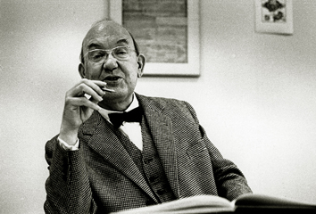
Jan Tschichold
Much work on understanding and explaining the importance of legibility and order was laid out by typographer Jan Tschichold in his books ‘The New Typography’ (1928), and ‘Asymmetric Typography’ (1935). Typically at the time, more emphasis had been put on the beauty and decoration of typefaces so Tschichold’s clean, structured approach was uncommon and considered quite ground-breaking.
As a survivor of WWI, Tschichold set out with absolute determination to change the world for the better, starting with the typographic principles laid out in ‘Die Neue Typographie’; ‘Setting aside everything dating from 1450 to 1914 as ‘the Old Typography’, Tschichold claimed the sans serif typefaces to be the only ones in spiritual accordance with modern times’ (Smith, 2005, p.16). Tschichold, along with other pioneers of early Modernism such as Walter Gropius, set about rejecting the unnecessary and the ornamental, stripping design and its principles back to their pure and most essential forms; ‘rejecting ornament and decoration as expressions of past centuries that had tolerated war, disease and poverty’ (Smith, 2005, p.16).
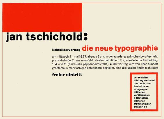
With this mind-set, Tschichold strove to re-educate designers of the importance of typographic structure and clear page layout, stating ‘the essence of the New Typography is clarity’ (Tschichold, 1928, p.66). According to Tschichold, the most logical way of laying out information should adhere to the modernist theory of increased legibility and comprehension, reading left to right, following the natural direction of the reader’s eye (Smith, 2005).
This teaching can be seen in his reproduction of Wili Baumeister’s 1924 invitation in which Tschichold has rearranged the information, adding typographic hierarchy and text placement to add rhythm and emphasis of the logical journey across the page. This piece of design demonstrates the early use of a grid system in which Tschichold can be seen implementing a strong left alignment of text and a clear, even border: ‘as startling, spare works, with bold sans serif typefaces, empty spaces, unusual angles and placements, and sometimes grainy photographs, they differed markedly from previous styles of printed matter’ (Smith, 2005, p.18). Some of the other rules laid out in ‘Die Neue Typographie’ discussed issues concerning the importance of using sans serif typefaces and the discarding of unnecessary colour. Tschichold believed that typefaces with ‘limited national character’ such as gothic fonts and black letter were not elementally designed and therefore limited the opportunity for international understanding. He disagreed with the need for unnecessary adornment on typefaces and believed that the objective role of type was to spell out clearly what it was trying to communicate (Tschichold, 1928).
In his opinion, the addition of extra ornamentation displayed a sense of naivety and lack of imagination; ‘a giving-in to a primitive instinct to decorate’ (Tschichold, 1928, p.118). Colour, he argued, should not be used excessively, explaining ‘a visiting card does not require three colours, and a poster generally needs more than just black and white’ (Tschichold, 1928, p.120). He expressed strongly the power of black and white visuals, especially when utilising a large degree of white space and outlined the properties of certain colours when printed; ‘Black…is the densest colour and seems to retire the furthest’ (Tschichold, 1928, p.120).
Josef Müller-Brockmann
As it happens, the breakthrough in the worldwide popularity of Modernism didn’t surface until much later in the 1950’s and 1960’s when the design style was adopted and rigorously developed by a group of Swiss graphic designers; originally named ‘Swiss Style’ it later became known as ‘International typographic style’ because of its adoption by so many other nations. The desire to communicate more legibly with the public led to the implementation of the mathematical grid by designers such as Josef Müller-Brockmann and Emil Ruder as a means of providing standardised order and a simple, unified structure. At the time, following WWII nations were looking to rebuild and were forced to reconsider centuries worth of traditions due to the brutality of the war. As such, the order and unified nature of these ideologies and practices appealed to many and were amalgamated into a concise design manifesto with the grid playing a fundamental role. Swiss typographic style and the implementation of the grid in design can be classified identically; over time the two grew simultaneously with one another.
During the war, Switzerland was a neutral nation and as such it attracted many intellectual refugees including designers like Jan Tschichold. It remained the only country in Europe in which functionalism could exceed its initial experimentation phase, developing into a national visual language. It was because of this that knowledge was more easily shared, and influences were drawn that would develop Swiss typography at an increased rate. ‘It was possible…for a fertile environment to develop, that could continue the progressive-optimistic ideals of the Bauhaus on the one hand, and develop an internationally influenced design dialogue on the other’ (Klanten, 2006, p.75).
Both Emil Ruder and Josef Müller-Brockmann wrote informative texts explaining the importance of grids and outlining the appropriate ways in which to use them. They both passionately maintained ‘that ‘integral design’ required structures that would unite all the elements in both 2-D and 3-D design: type, pictures, diagrams, and compositional space itself (Roberts, 2008). Josef Müller-Brockmann learned the initial modernist design principles at the Bauhaus and later drew great influence whilst working at the Zurich school of Design from Jan Tschichold. The two shared beliefs in the importance of clarity and creating works that were devoid of personal opinion or bias; ‘…if it was to inform and enlighten without being manipulative it had to be based on objective criteria’ (Muller, 1995, p.17). Renowned as one of the most prominent experts in the Swiss school of International Typographic Style, he became recognized for an ongoing series of posters he designed for concerts at the Zurich Town hall. ‘In 1951 he attempted subjective graphic interpretation of individual musical works. This sophistication was scarcely perceived by the public. It gave way to a freer interpretation of the music for single concerts or concert series’ (Muller, 1995, p.32).
As the years progressed his work for this client became more graphic, with no illustrative adornments and the ‘Free-floating, two-dimensional elements were abandoned in favour of a strictly constructive approach for his 1955 “Beethoven Poster” (Muller, 1995, p.32). However, this did not stop the later editions of his concert posters becoming some of his more renowned and recognised works; ‘the “musicality” of the design was retained; the combination of constructed figure and composers name not only evoked immediate associations with music in general but also with Beethoven in particular’ (Muller, 1995, p.32). Critics have stated that the complex grid systems behind the posters create a sense of mathematical harmony; one that reflected the harmony of the music (Schnieder, 2011).
The journey from his first concert poster in 1950 to the designs he was producing in the mid 1970’s underwent a distinctive modernist evolution, with influences from Swiss Style Design easily traceable. His main design task during the 1950’s was to design posters that would successfully communicate to wide audiences, transcending language barriers since the population of Switzerland consisted of a range of nationalities including English, French and German. Relating Modernism to the social situation at the time, McCandless explains the way in which Müller-Brockmann was able to unify people in a post-war society with his designs; ‘Modernism exudes order and rationality: in the context of the politics that lie behind this movement, the more ordered a society is, the better it functions’ (2009, p.132). It was the success of a poster series that was so concise yet so powerful in delivering its message that inspired and influenced so many others of the time.
With this notoriety, Müller-Brockmann soon established himself as the leading practitioner of the Swiss Style, championing objectivity, clarity and the use of the grid both in his designs and his various publications; ‘the withdrawal of the personality of the designer behind the idea, the themes, the enterprise, or the product is what the best minds are all striving to achieve’ (Muller-Brockmann, 1968, p.9).
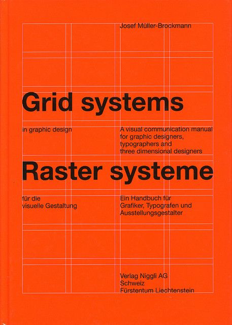
This ideology was also supported by Emil Ruder in his publications; ‘the typographer must be able to take the impersonal view; wilful individuality and emotion have little place in this work’ (Ruder, 1967, p.10). In his book ‘Grid systems in Graphic Design’ Müller-Brockmann explains in very specific detail how both modular and column-based grids can be combined and used to create any desired layout in both 2D and 3D design. In an interview with Eye magazine in 1995, he explained his obsession with the use of grids and the passion behind his need for order and clarity;
Even today, Graphic Designers seek influence from Müller-Brockmann and the objectivity behind his design principles are considered ‘timeless … the idea that a client’s message, not decoration, should be at the forefront of any piece is held in high regard by designers’ (Armstrong, 2009, p.10). Much like his concert posters, Müller-Brockmann is revered for his designs of public service announcements. As observed in many of his other works, they are clean and simple, yet bold and successful in delivering their message with a desired sense of urgency. Unlike the music posters, the series he completed for the Swiss Automobile club features imagery that isn’t made up of shapes, instead using screen-prints of photographed scenarios. Paired with a short, punchy slogan in his favoured typeface ‘Akzidenz-Grotesk’ the message is clear and understandable, even to those not familiar with the German language; ‘The dramatic confrontation of speeding motor-cycle and vulnerable child makes an ambiguous and forceful pictorial statement’ (Muller, 1995, p.32). Again, we can see Josef Müller-Brockmann overcoming various social barriers to successfully produce design that is both encompassing and universally understood.
Emil Ruder
Emil Ruder was another influential designer that played a key role in the progression and promotion of the Swiss Style in the 1950’s. Much like Josef Müller-Brockmann, Ruder believed resolutely in the importance of design for social change. Alongside Armin Hoffman, he taught at the Basel school of Design and encouraged his students to promote ‘the good and the beautiful in word and image and to open the way to the arts’ (Hollis, 2006, p.160). Just as other pioneers of Modernism believed, Ruder considered the combination of typography and photography to be the ultimate form of visual communication, and developed many of his work into posters which was thought to be the most effective way of communicating with the masses. He frequently employed a page grid within his work and was renowned for his demonstration of the use of a 9-square grid system from which he maintained there were 24 possible outcomes of shape and image position.
Despite his passion for image based work, Ruder never experimented with frivolous composition and playful design, stating ‘spontaneous and fortuitous results are foreign to the nature of typography, for the typographical system is based on clarity and precise proportions’ (Ruder, 1967, p.162); he was dedicated in demonstrating that the initial purpose of printing processes was to achieve legibility.
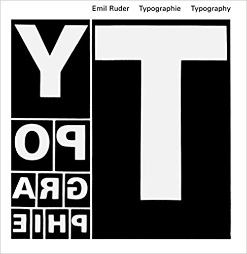
He remained devoted to the notion that the aim of typography was communication and became an expert in the art of letterpress printing; ‘A printed work which cannot be read becomes a product without purpose’ (Ruder, 1967, p.8). In the space of two years, between 1957 and 1959, Ruder completed a four-part series of articles titled ‘Wesentliches’ meaning ‘Fundamentals’ with the subheadings: ‘The Plane’, ‘The Line’, ‘The Word’ and ‘Rhythm’ which formed the foundation of the thinking behind his book ‘Typography: A Manual for Design’, published in 1967. Much like his modernist predecessors, Ruder stressed the importance of legibility and order in ‘Typography’, and showcased his thoughts on the use of white space in both the letterform itself and its role as a prominent feature in successful page composition. This ideology is still being enthusiastically used today in both print and web design.
Helvetica
The journey to discover and create design that was universal yet indifferent led to the development of various sans-serif typefaces during the 1940’s and 1950’s. One of the most distinguished of these was Helvetica which was designed in 1957 by Max Miedinger and Eduard Hoffmann at the Swiss type foundry Haas. Originally titled ‘Die Neue Haas Grotesk’, it was inspired by an existing Haas font ‘Normal Grotesk’ but was produced to compete with a popular font on the market ‘Akzidenz-Grotesk’, which as discussed earlier was already in use by many modernist designers at the time, including Josef Müller-Brockmann.
As a grotesque font, as opposed to a more humanist font like Univers, it was designed to be intrinsically neutral, boasting a clarity that meant it could be used on various genres of signage and publications. In keeping with the core principles of the movement, importance was placed on ensuring that the typeface was unbiased, universal and could communicate to all; ‘It is no accident that two significant new type designs for ‘universal’ use, one hailing from France, Adrian Frutiger’s ‘Univers’, and the other from Switzerland, Haas Type-foundry’s ‘Helvetica’, went head-to-head to corner the corporate market’ (Black and Garrett, 2018).
In 1960 its name was changed from ‘Die Neue Haas Grotesk’ to ‘Helvetica’, form the Latin word ‘Helvetia’ meaning Switzerland, to boost its marketability and aid in making it internationally popular. When Helvetica was designed in a post-war Europe, many businesses and government bodies were looking to refresh their branding from the decorative typography and impressive ligatures they had featured before. Helvetica’s sleek structure and professional sensibilities appealed to those corporations looking to disassociate themselves with the brutalities of the recent past; ‘corporate art departments in the 1950s and 1960s understood Helvetica to be the neutral, lucid counterpart of their glass buildings’ (Smith, 2005, p.9). The neutrality of the typeface meant it worked in many genres of branding; conservative or edgy, elegant or relaxed.
The make-up of Helvetica’s glyphs has as much to do with the white space surrounding them as the letter forms themselves. The spacing and weight structure of the letters meant that the font remained legible when in motion, which appealed to transport and airline companies. As such, Helvetica quickly became popular around the world as people began to recognise it in daily aspects of their lives.
In the decades following 1957, influential graphic designers like Wim Crouwel and Massimo Vignelli utilised Helvetica in some of their most acknowledged works, aiding it on its journey to becoming one of the most celebrated characteristics of the Swiss Style; encapsulated in the American Airlines rebrand in 1967 by Massimo Vignelli. Utilising the Helvetica typeface and a limited yet patriotic colour palette, Vignelli revolutionised the idea of standout, iconic logo design to such an extent that the American Airlines branding remained unchanged until 2013. The idea that neutrality is at the core of the design direction behind Helvetica can be further demonstrated by its diverse usage, even up to the 21st century. Large corporations ranging from 1950’s interior designer ‘Mutschler’ to the 2000’s logo branding for ‘American Apparel’ have utilised Helvetica for its continuous impression of modernity, ensuring that is remains ‘so ubiquitous it is almost invisible’ (Muller, 2002).
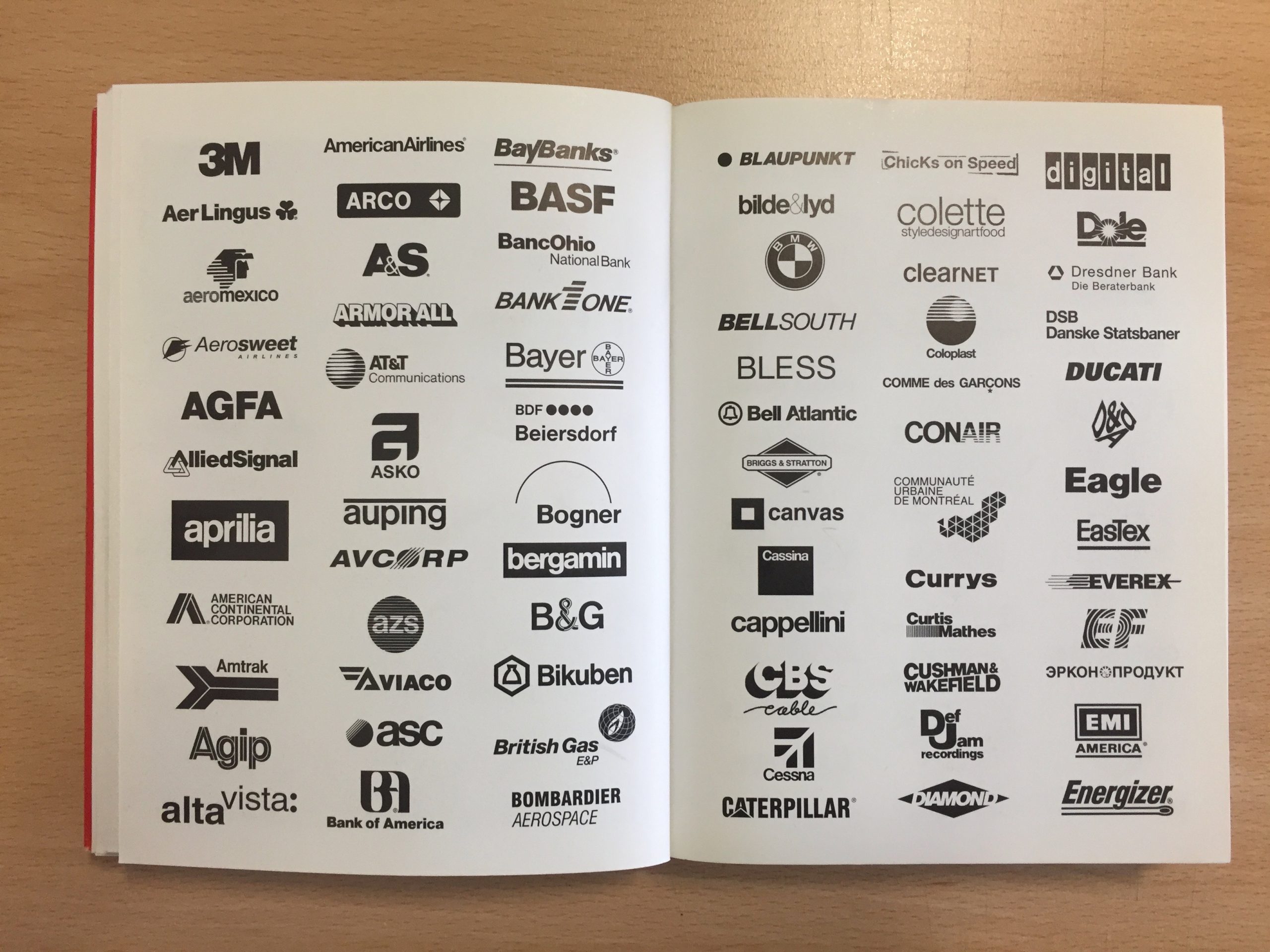
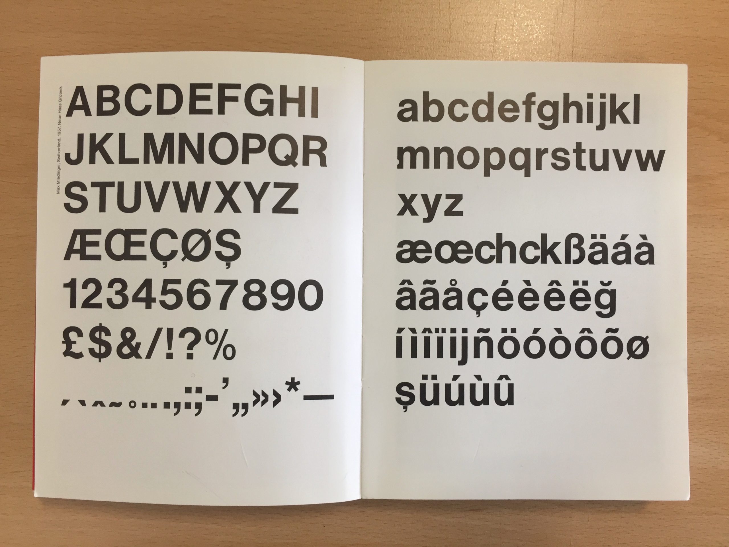
With his in mind however ‘calling it the typeface of capitalism would miss the mark, if one must mention ideologies, one would have to associate Helvetica more with socialism: accessible to all’ (Muller, 2002). The very ethos behind the typeface and the movement it is so readily associated with would argue that the nature of Helvetica only furthers the beliefs of universal design. In April 2007, the Museum of Modern Art in New York City displayed an exhibition titled ’50 years of Helvetica’ with the aim of highlighting its diverse and prevalent usage since its birth in 1957.
Continued in Part 2…